Visualisation in research
Visualisation is key in any project involving datapoints. Yet the reader is not ‘showered in graphical displays’ [Anscombe, 1973]. I am an active promotor of the use of visualisation, and try to help people make graphs in several ways: i) by making the graphs for them; ii) by giving visualisation-workshops in R; iii) by creating R-packages that facilitate the use of graphs.
Visualisation is perhaps the easiest way to get good insights into the data at hand; whether for yourself or for the scrutinty of others. Disappointingly, most graphs in scientific papers do not attempt to show the (raw) data, but instead show some summary measures (e.g., a bar plot of means). This hinders the scientific process. I hope to increase visualisation literacy, by:
- Helping others to think about graphs and to create them using ggplot2. I’ll happily do this for you too.
- Giving visualisation courses and workshops; for instance, this one, this one, and a shorter version
- Creating R-packages that help people visualise, including ggplotgui and ESMvis [under development; together with Laura Bringmann].
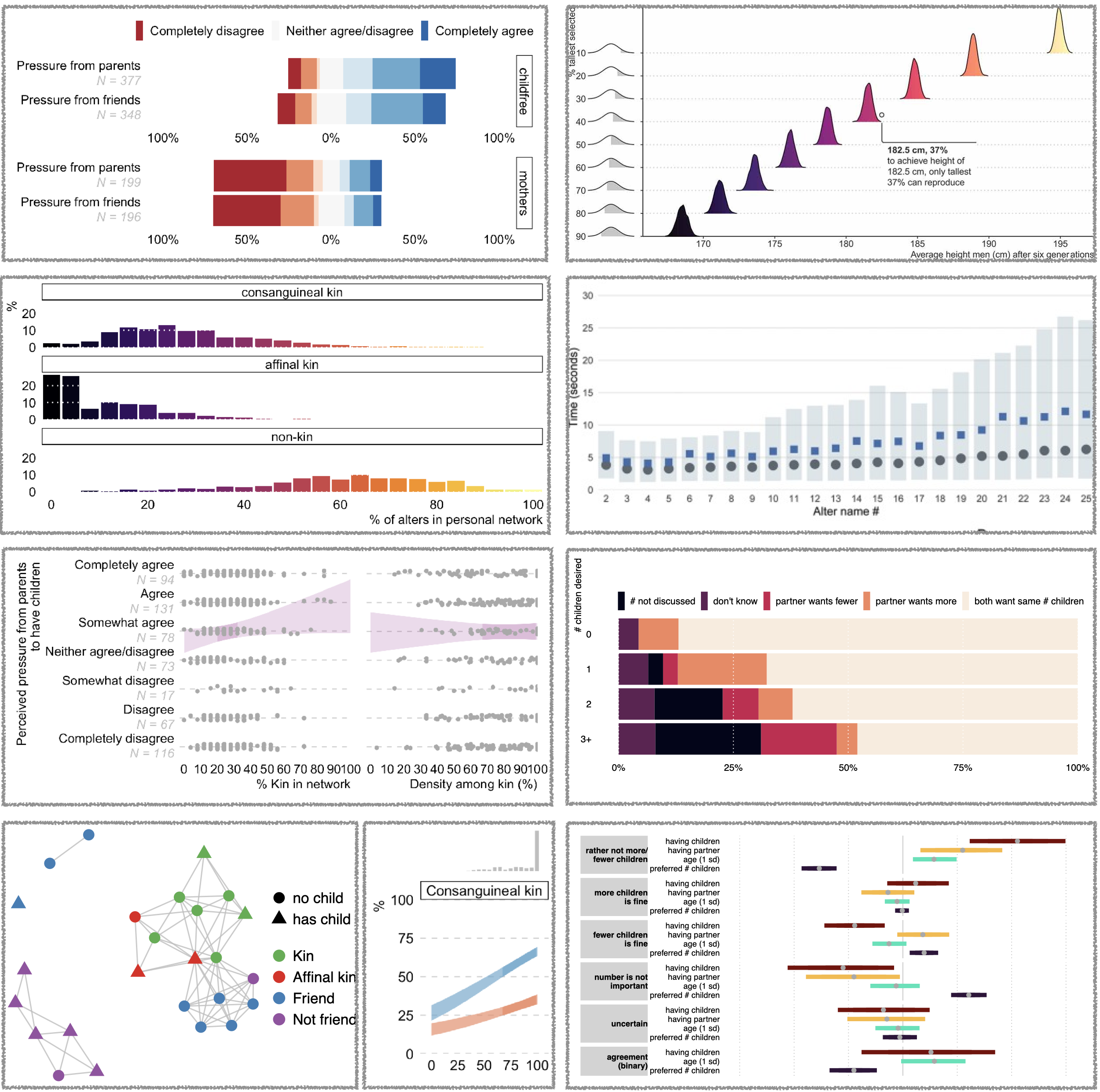
Here is a small portfolio of graphs that I have used in my research: